For reasons unbeknown to most people I recently decided to graph my HbA1c results over the last few years.
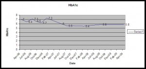
The graph is quite astonishing. It starts with peaks and troughs, rising above and below 7% but never really settling. It reflects the reality of my diabetes a couple of years ago – I could get my HbA1c down to about 6.5% but it was a struggle. Quality of life really suffered, hypos increased and it was really hard work. That meant that I couldn’t sustain the effort needed to keep it that low, I always reverted back to normal life which meant an HbA1c of 7 ish, not bad but not what I was looking for.
About a third of the way in the graph plummets, like a lemming off a cliff. That’s the change between my HbA1c of 7.3% in Jan 07 and my HbA1c of 6% in June 07 just 4 months after I started using my Medtronic Paradigm pump and CGMS.
I fought for the pump and CGMS because from the research I’d done I believed they were the tools I needed to help me get tighter control. HbA1c levels of people with a working pancreas are generally around 6.2% or lower. In my dreams that’s what I wanted to achieve. On injections I once managed to get as low as 6.2% but it was a blip and certainly not something I could sustain.
So the graph shows that I could get lower than I’d ever done before with my new pump, but was that just the placebo effect? Diabetes is pretty boring, requiring attention day in, day out so it’s only natural that any change in treatment would re-ignite my interest and make me try harder for a while. But look at the graph, from a couple of months after starting the pump until the present day it’s virtually flat. I’ve been flatlining for over 2 years. I can’t sustain artificially high levels of interest in something for that long. And I can confirm that I’m not dead, so the only explanation for the flatlining is that I’ve finally found a tool that gives me the ability to control my diabetes as I want to.
I’ve never graphed my results before, unsurprisingly the urge has never taken me. Having done it, I’m amazed by the story it tells. I hadn’t realised quite how much my results bounced before I got the pump, when I see that picture I recognise the struggle between trying so hard to drive down the result and then taking my foot off the gas and seeing it bounce back up again. For over a year now I’ve had the feeling that my diabetes is reasonably settled. I still have bad days, random blood sugars, hypos, times when I forget to bolus and times when I’ve had enough of the whole thing, but they’re much rarer now.
The graph shows that I seem to have the tools and approach I need to have good control and quality of life. It took a lot of hard work to get it working for me, but what a difference the right tools make!

Very interesting Alison; I’ll have to dig mine out and graph them so we can compare MDI to pumping.
Pingback: Good diabetic? Bad diabetic? | Shoot Up or Put Up
Pingback: Grand Rounds Vol. 5 No. 51, comes to Paramedicine! « Medic999
Pingback: Shock news, CGMS works! | Shoot Up or Put Up